Role
Product Designer
Timeline
1 Month, 2024
Team
Solo
Skills
Product Design
.
Brand strategy
.
Tools
Figma, Lottie

Problem
Healthcare apps assume digital confidence that older adults don’t have
Older adults regularly use smartphones, but still struggle with complex app interactions—especially in healthcare.
Research and analysis | Heuristic evaluation |
|
|
Opportunity
Designing for independence, not just functionality
Healthcare apps can move beyond feature-heavy systems by focusing on clarity, confidence, and usability. With the right approach, the system can:
Reduce cognitive loadSimplify complex workflows into predictable, step-by-step interactions | Support independent agingEnable users to manage their health without feeling overwhelmed | Enable assisted careAllow caregivers to support when needed without removing autonomy |
Solution
A calm, accessible app for managing health with confidence
KairPlus integrates key healthcare tasks into a unified, accessible experience.
Guided onboarding with step-by-step setup
Clear medication tracking and reminders
Appointment scheduling with confirmation flows
Optional caregiver collaboration
Centralized health records
The system shifts healthcare management from overwhelming to manageable.

Design Approach
Prioritizing clarity, independence and trust
Design for clarity over density
Support independence first, assistance second
Reduce onboarding friction
Establish emotional trust

Research
Usability issues come from system design, not user ability
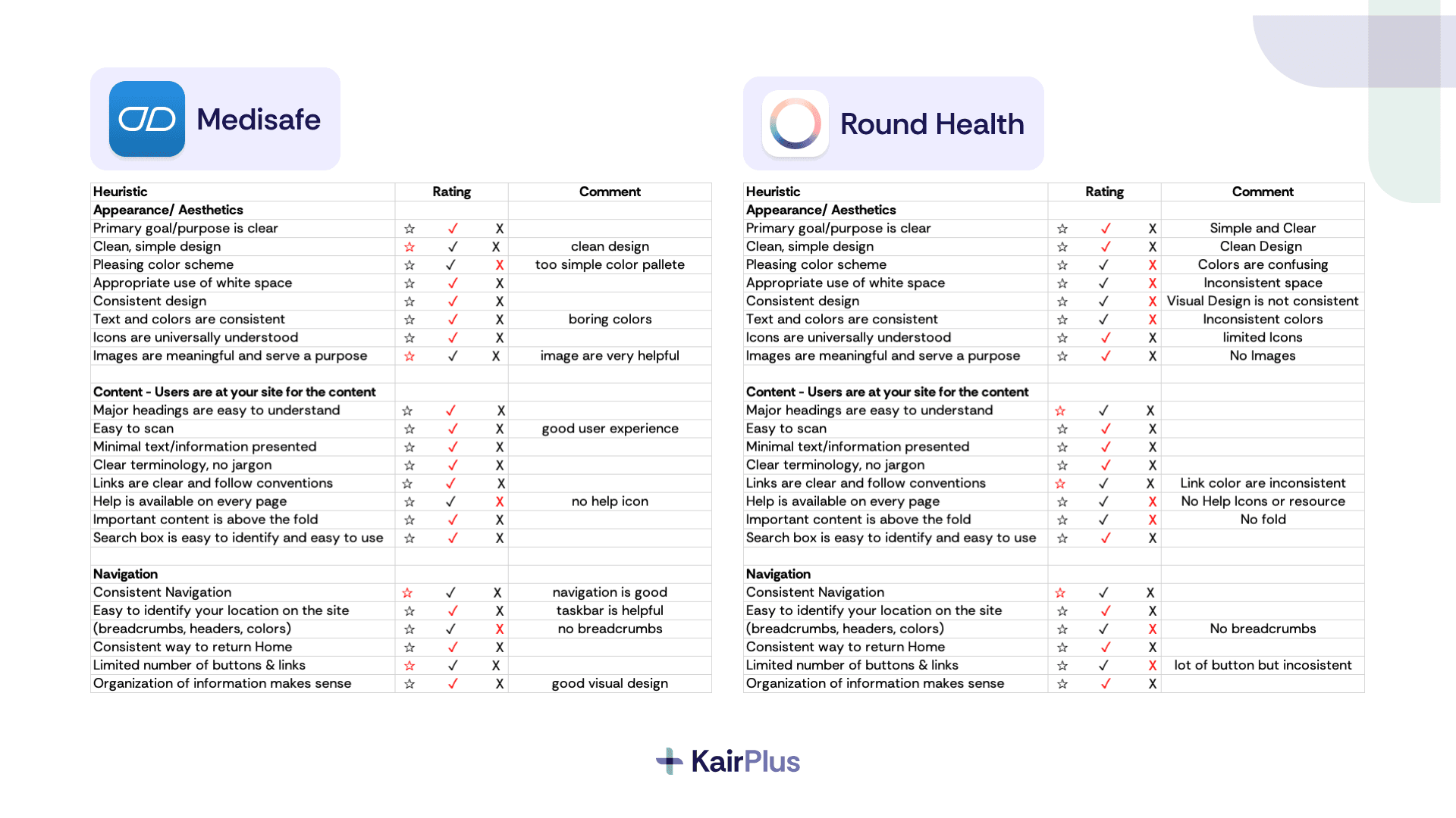
Heuristic Evaluation
Analysis of apps like RoundHealth and Medisafe revealed:
Poor hierarchy and inconsistent design
Lack of guidance and unclear interactions
Visual inconsistency and confusing layouts
Journey Mapping
The journey map highlighted friction points:
Onboarding feels complicated
Entering medication details is time-consuming
Scheduling appointments is frustrating
Users rely on reassurance and confirmation
“Creating an account seems a bit complicated.
“Entering medication details is taking longer than expected.”


Process
Translating usability issues into a simplified system
Defined persona (Mary Thompson) and mapped full journey
Translated pain points into design opportunities
Designed core flows: onboarding, medication, appointments
Iterated into high-fidelity prototype


Prototype
Translating clarity into a structured, accessible interface
The final UI focuses on readability, predictability, and reassurance.
Key flows include:
Onboarding with step-by-step guidance
Medication tracking with clear inputs
Appointment scheduling with confirmation
Caregiver collaboration
Centralized health records


Reflection
Learning to balance aesthetics with usability for a specific audience
This project challenged my tendency to over-prioritize visual aesthetics. I often focus deeply on how polished or visually refined an interface feels, sometimes overthinking whether it looks “beautiful” enough.
Simplicity is not a compromise in aesthetics—it’s a form of respect for the user.